Alluvial population visualization
Fifty cities, traced back to their continents.
Weekly list pages, quarterly market charts and scrolling data features for three California business journals, in print and on the web.
Staff design work for American City Business Journals between 2018 and 2022, across the Silicon Valley, Sacramento and San Francisco titles. The output was print and web: the weekly List page, quarterly commercial market wraps, and occasional scrolling features built around a single dataset.
Each piece was built from a published external dataset, credited in the graphic. Cushman & Wakefield for commercial market figures, Yelp Economic Average for business reopenings, and the Bureau of Labor Statistics for wage change.
Data Dive ran weekly: a supplied dataset, a fixed page slot, and a deadline. What holds the run together is not a house chart style but a house discipline. One encoding per measure, the source line set as type, and the headline doing the interpreting so the chart does not have to.
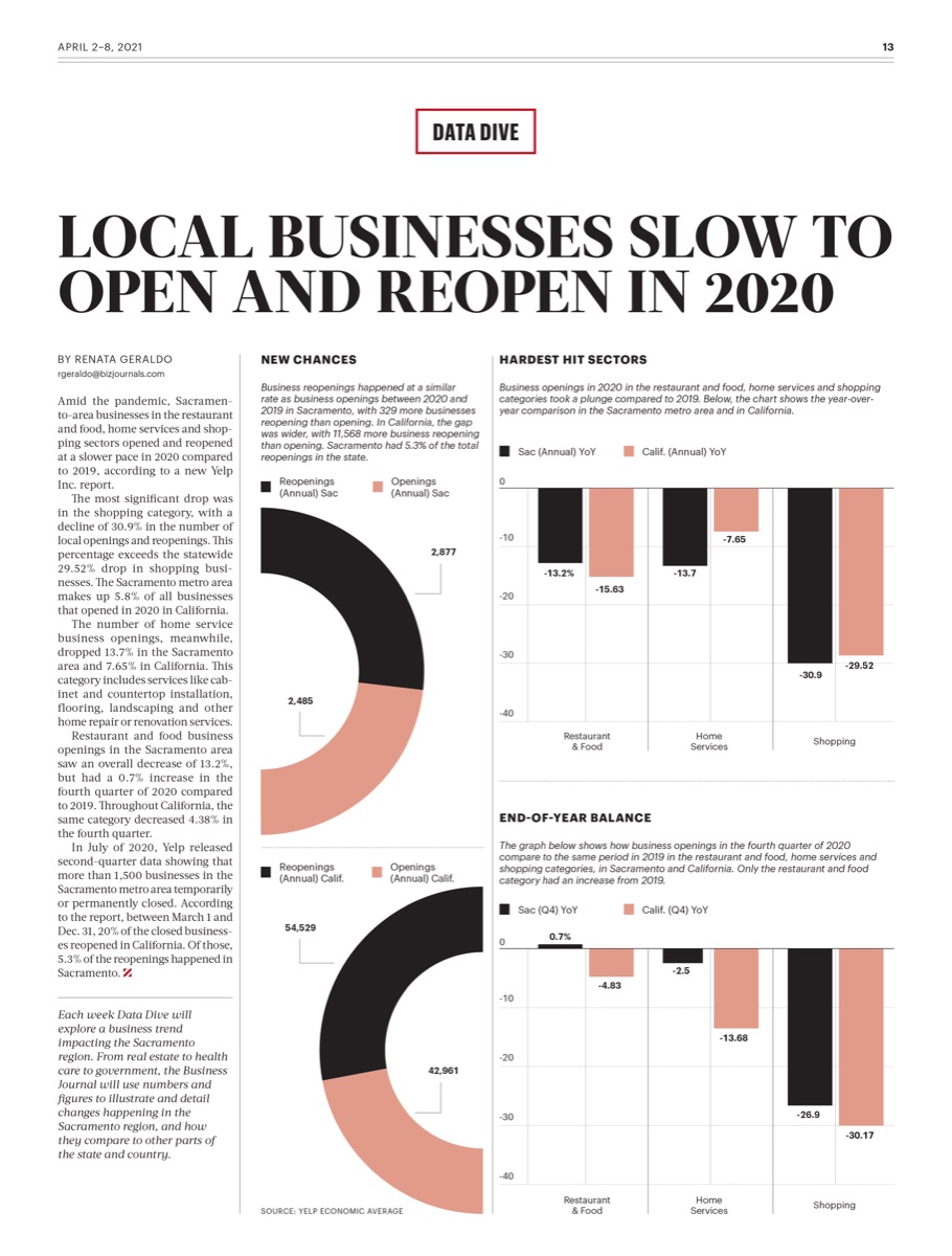
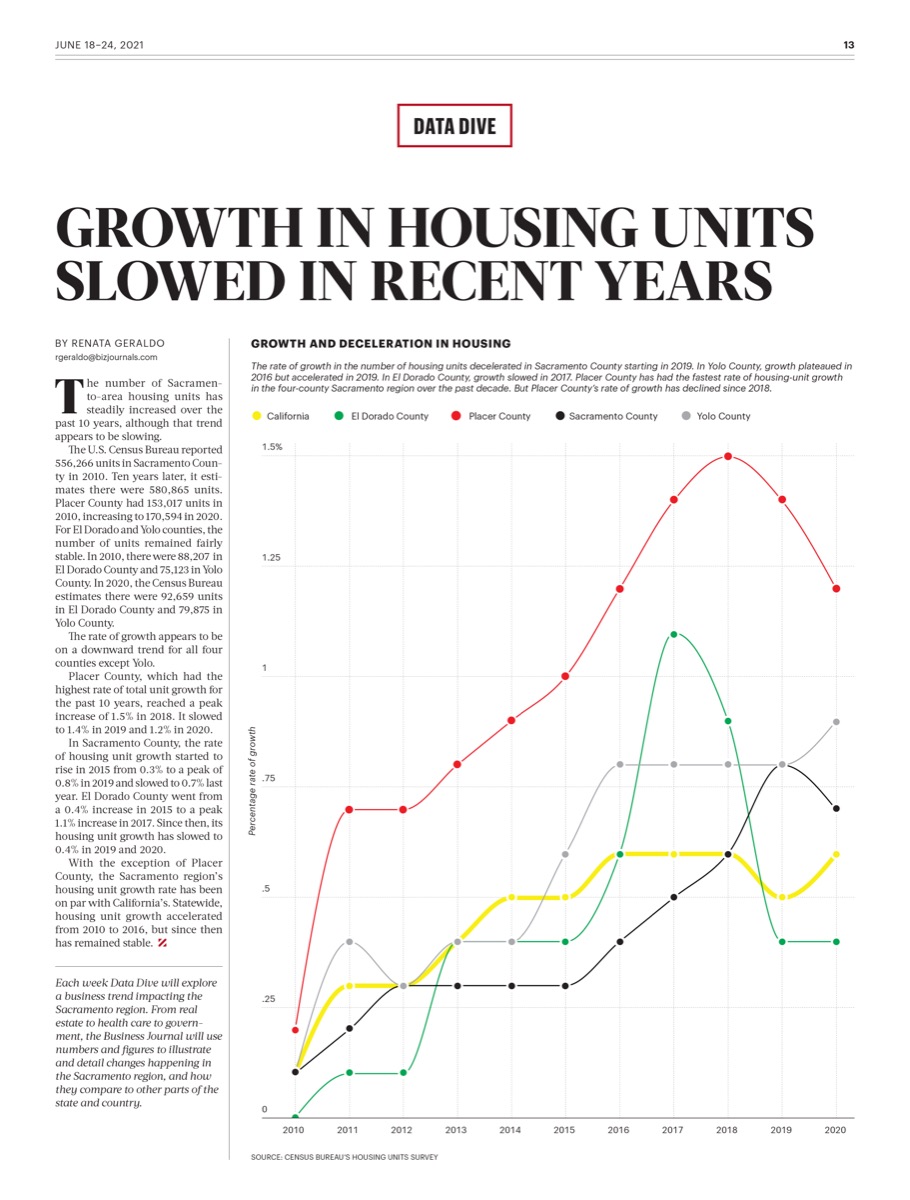
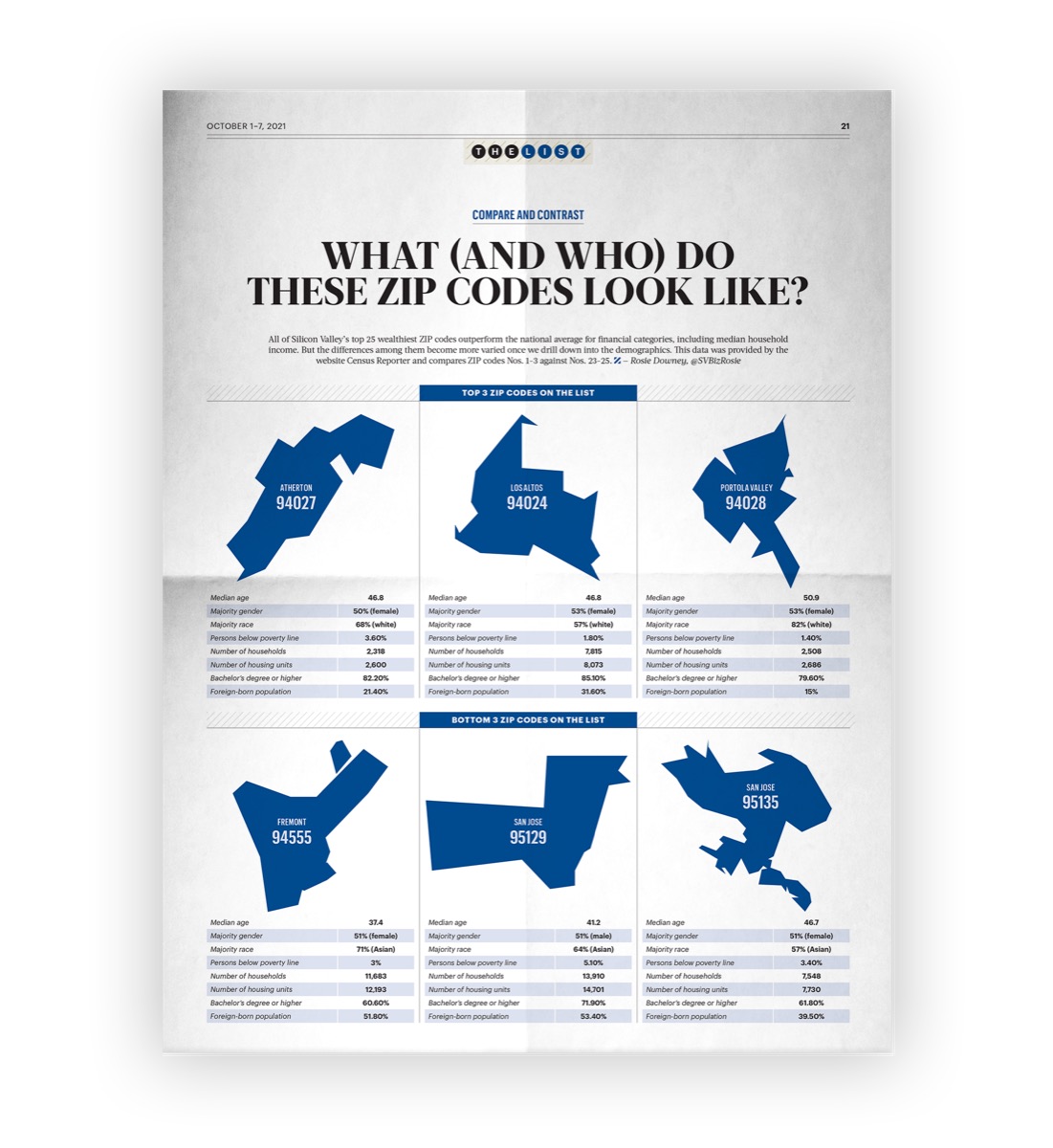
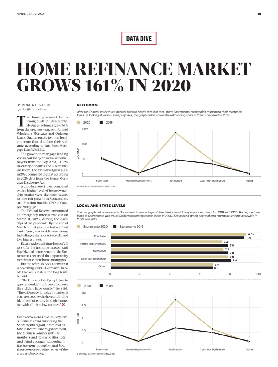
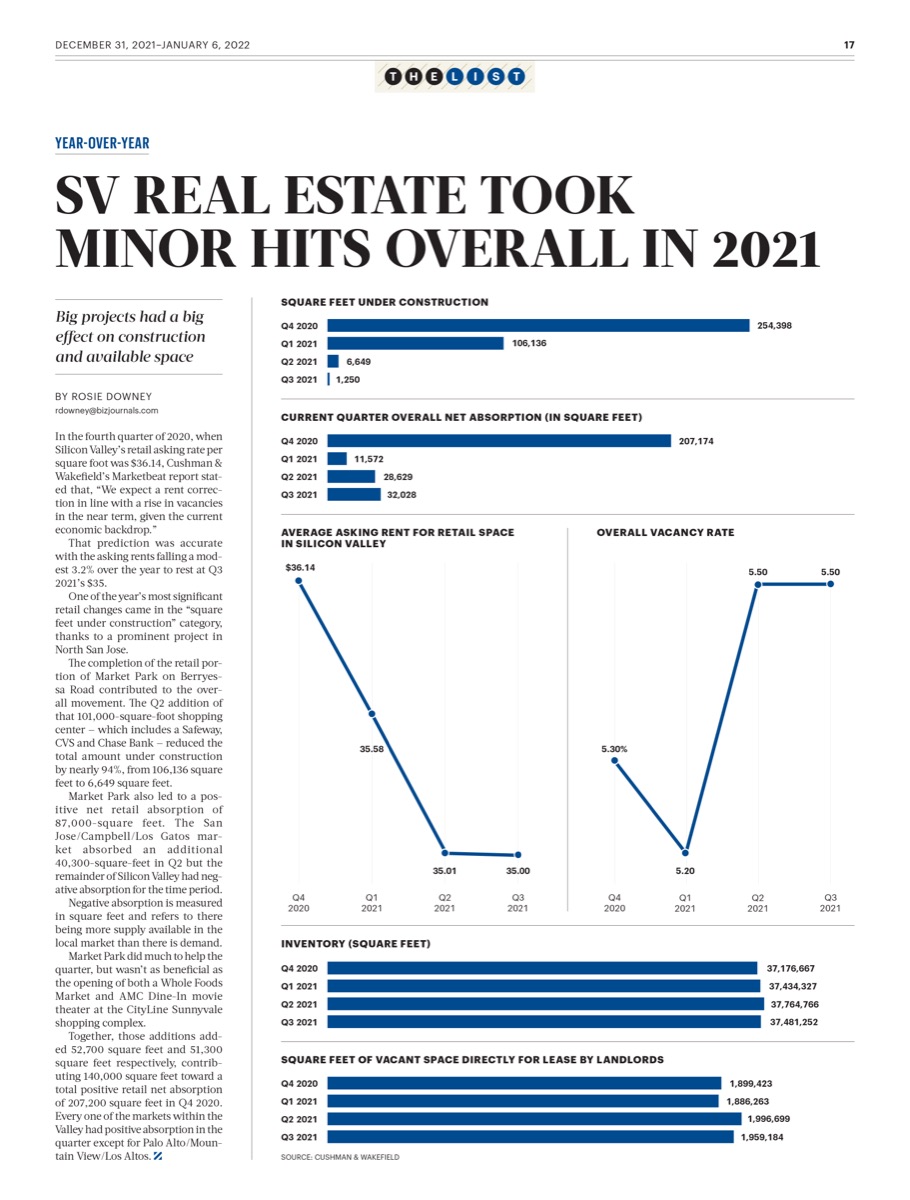
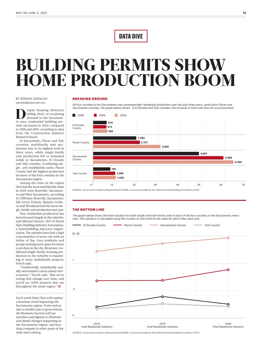
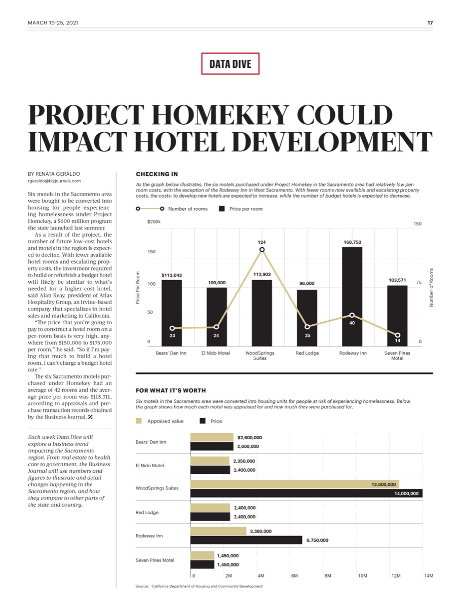
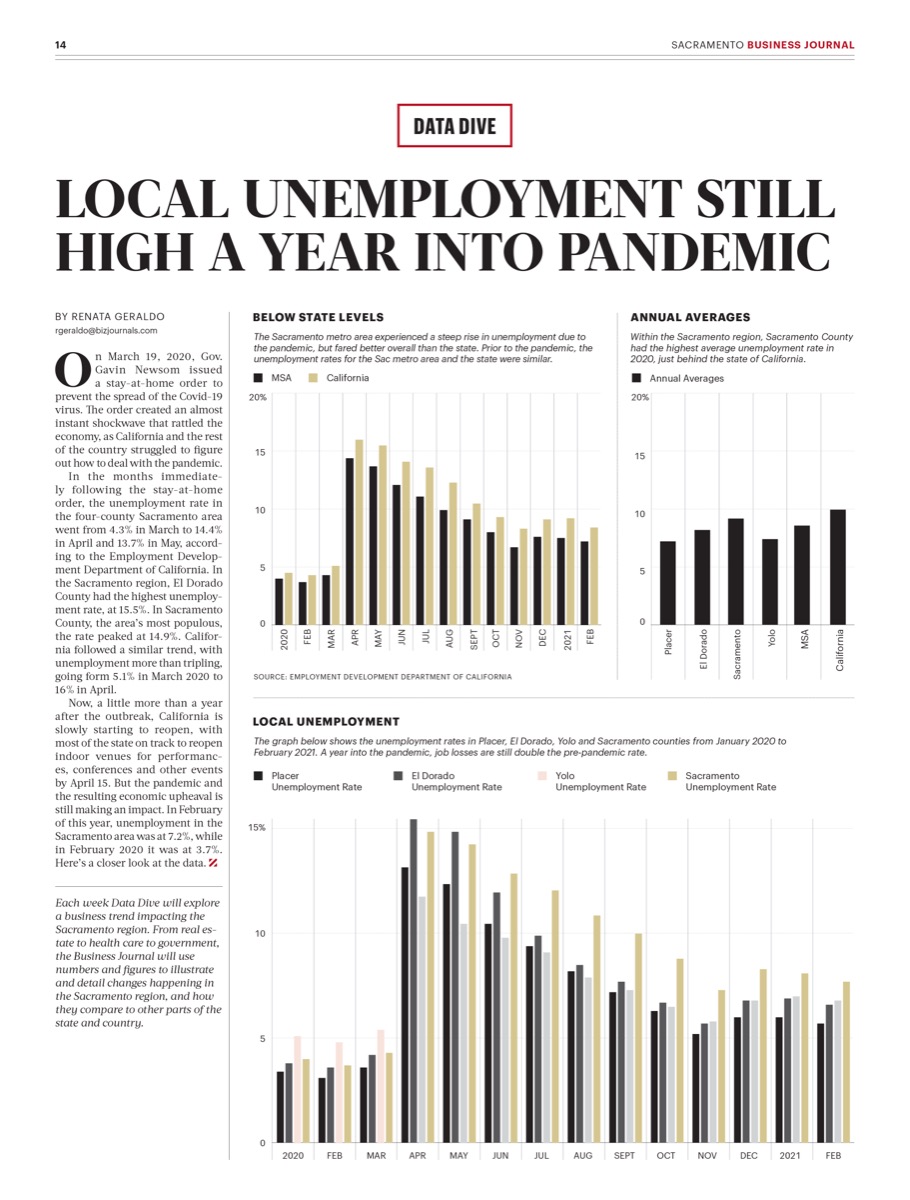
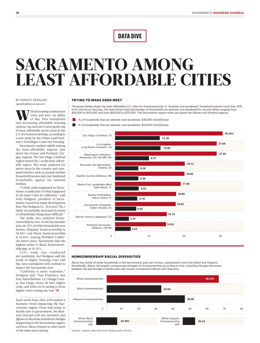
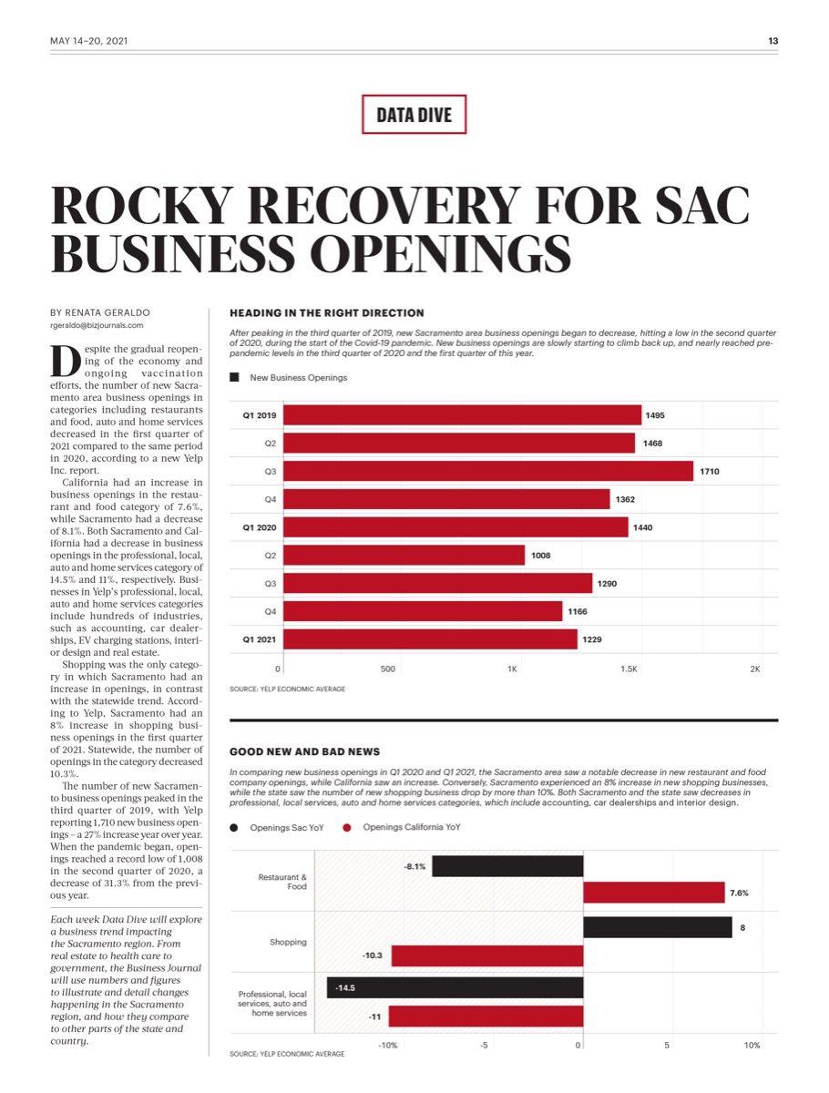
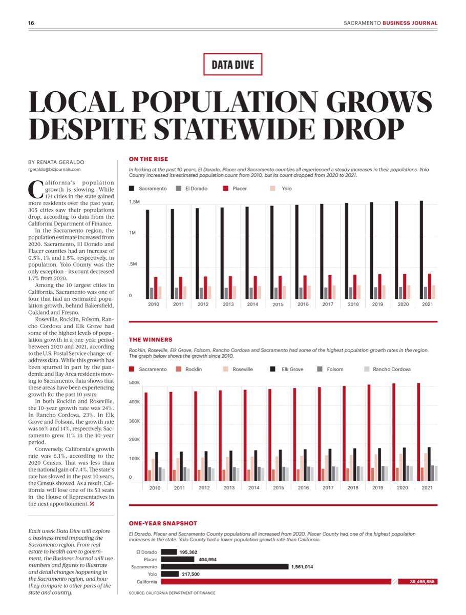
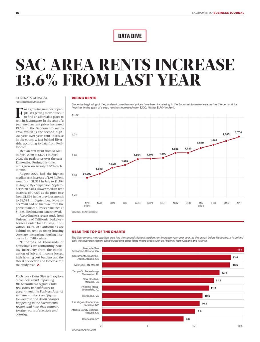
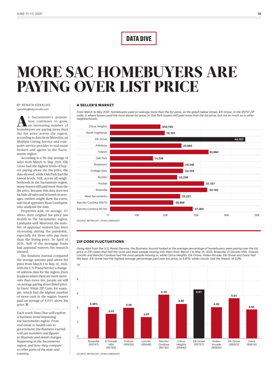
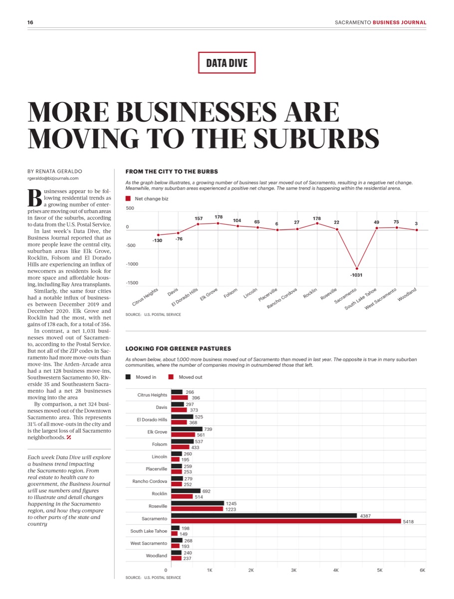
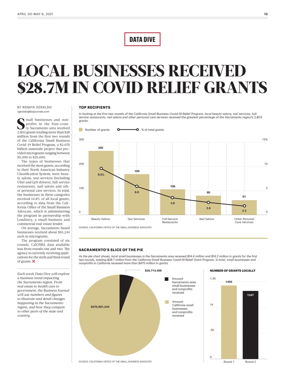
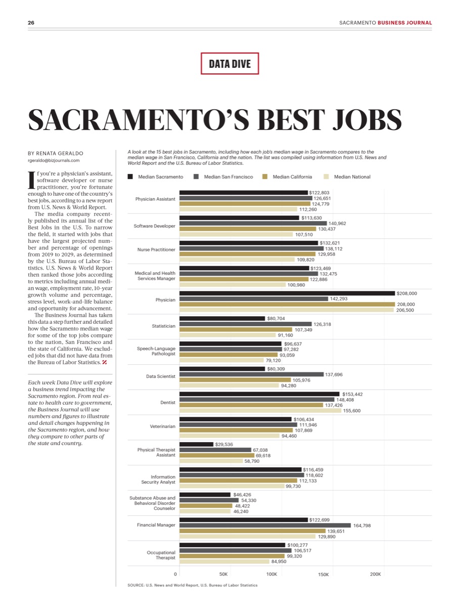
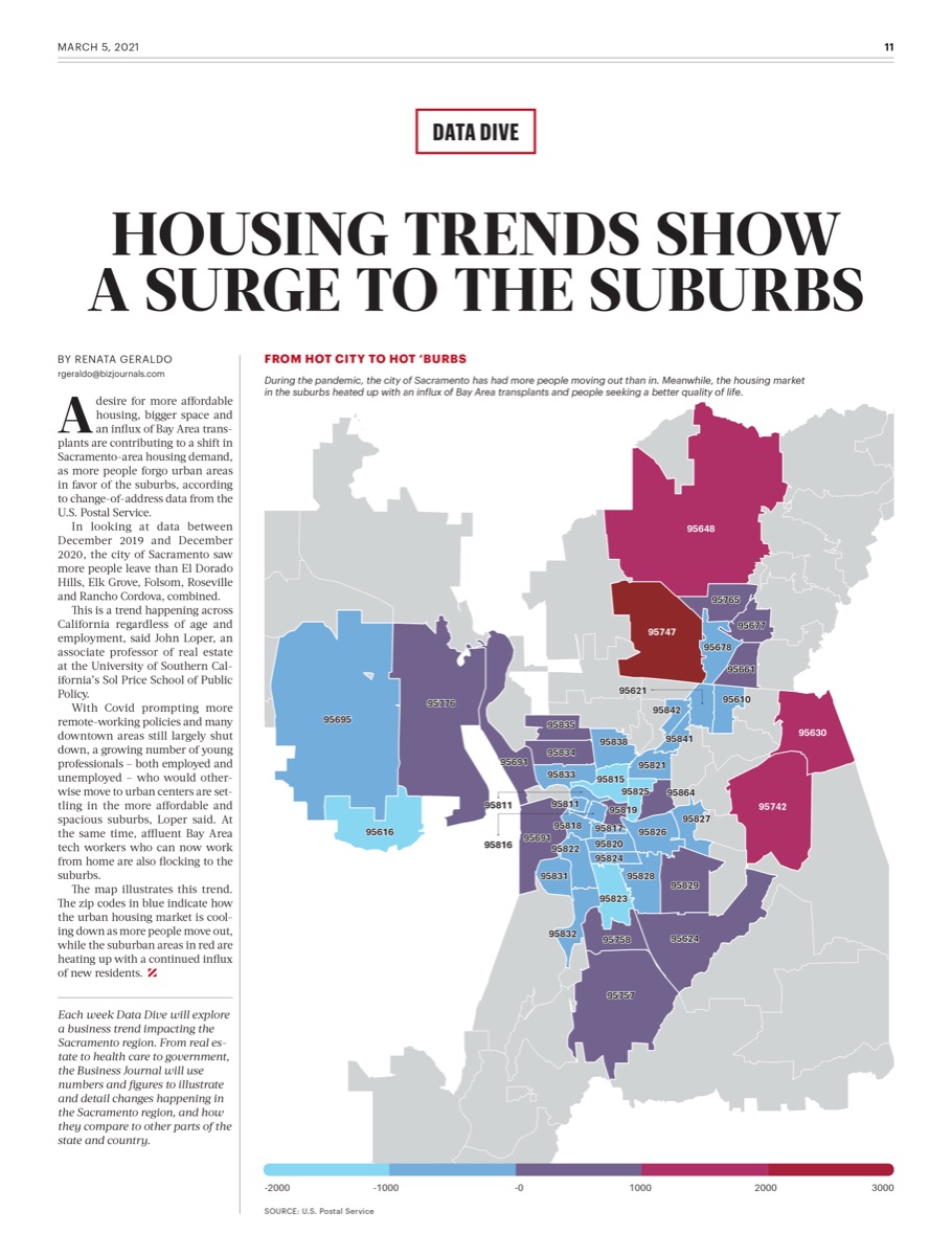
Each graphic started from a dataset that arrived from an outside source on the publication's schedule, and had to land in a page slot whose dimensions were set before anyone saw the numbers. The List page carries six separate measures on one sheet. The reopenings feature splits across three scrolling sections. The wage piece is a single comparison with an explanatory note.
The List page holds six measures on a single scale treatment: one bar to a quarter, a shared baseline per measure, and the quarter labels set beside the bars instead of in a legend. Two of the six switch to a line where the measure is a rate instead of a volume.
The web features invert to a dark ground and carry their series labels as captioned dots beneath each chart. On all three, the source credit is set as part of the graphic instead of added underneath it.
The measurable output is the run itself. A data page a week across four years and three mastheads, on deadlines that did not move. The same grid carried routine market wraps and breaking cover stories without changing its rules, which is the test of a system instead of a style.
The discipline built here, one encoding per measure, sources set as type, the headline doing the interpreting, is the same one that now runs under fifty-plus healthcare dashboards. The newsroom is where I learned it at speed.
Fifty cities, traced back to their continents.