Chris Almaguer Data visualization design

Branding

Identity and branding

Identity work sits at the edge of the editorial practice and runs on the same discipline: one idea carried through every application. Five marks for restaurants, events, institutions and trades, and one identity taken the whole way through as a full branding study.

Branding On request

01 - Marks

Identities for events, institutions and trades

A smokehouse, two business journal events, a historical society and an electrical contractor. Different rooms, same problem: one idea that survives every size it gets printed at.
Marks

5 marks, 2019 - 2021
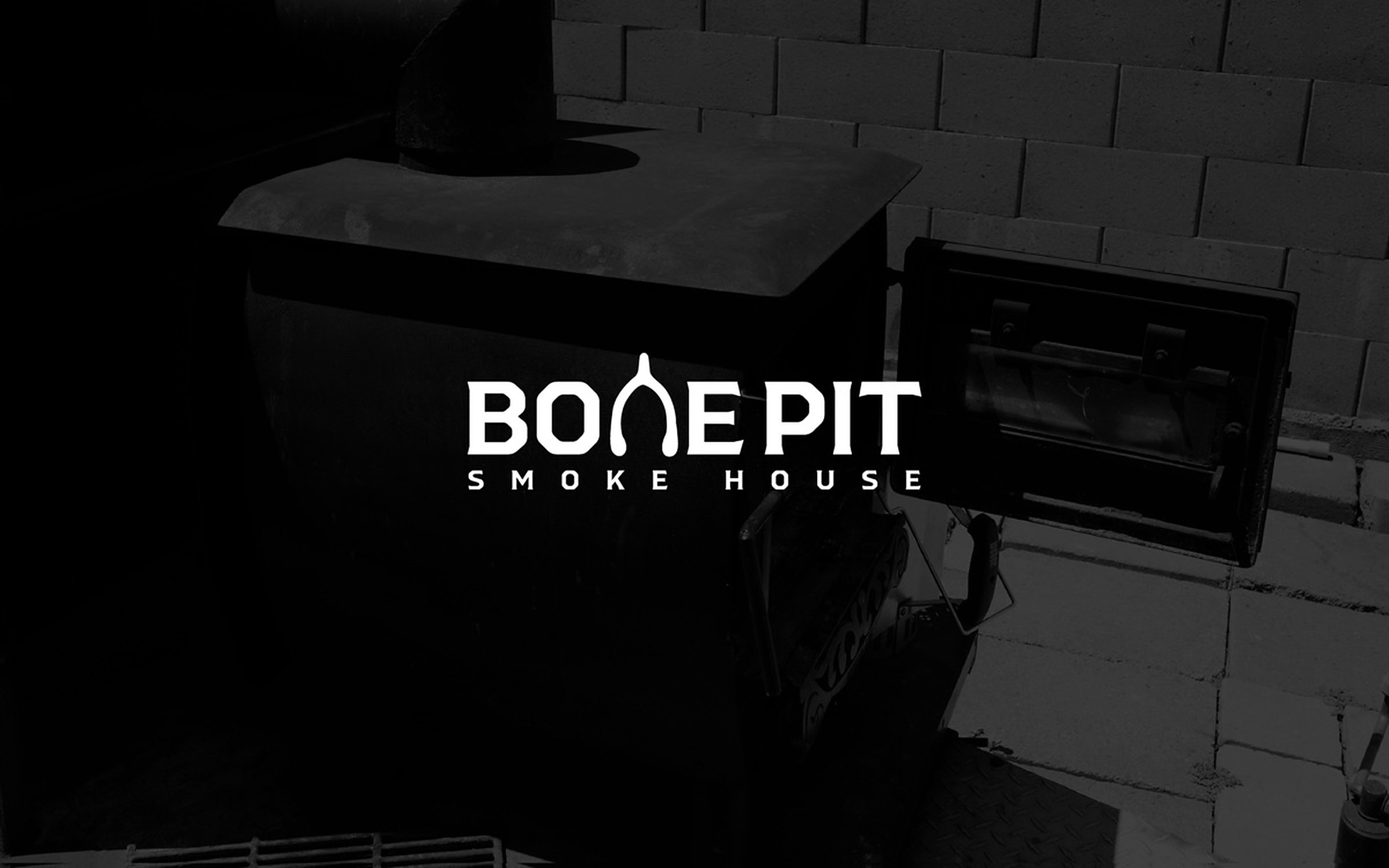
The Bone Pit Smoke House wordmark, its N drawn as a wishbone, reversed in white over a photograph of the smoker.
Bone Pit Smoke House. Mark for a local barbecue smokehouse.
Best of the Bar, an awards identity for the Sacramento Business Journal: gold and white type over a courthouse colonnade, with scales of justice set into the lockup.
Best of the Bar. Awards identity, Sacramento Business Journal.
Redefining the Core, an event identity: the O of CORE drawn as a concentric target in yellow and red over a grey Sacramento skyline and street grid.
Redefining the Core. Event identity, Sacramento Business Journal.
FANHS, the Filipino American National Historical Society Stockton chapter mark: a rising sun with rays behind the letterforms, the F drawn as three stripes.
FANHS, Stockton chapter. Filipino American National Historical Society.
Almaguer Electric Co.: a plug-headed character in a hard hat waving beside the wordmark, drawn in black line on yellow.
Almaguer Electric Co. Character mark for an electrical contractor.

02 - Branding study

One mark, carried the whole way through

A full identity study taken from sketch to application: the cow set inside the Texas star, a two-color system of black and hot pink, and the boards that follow the mark onto signage, packaging and the storefront. The client is Los Canelo's Birria, a Texas restaurant.
The branding study

1 mark, 13 boards
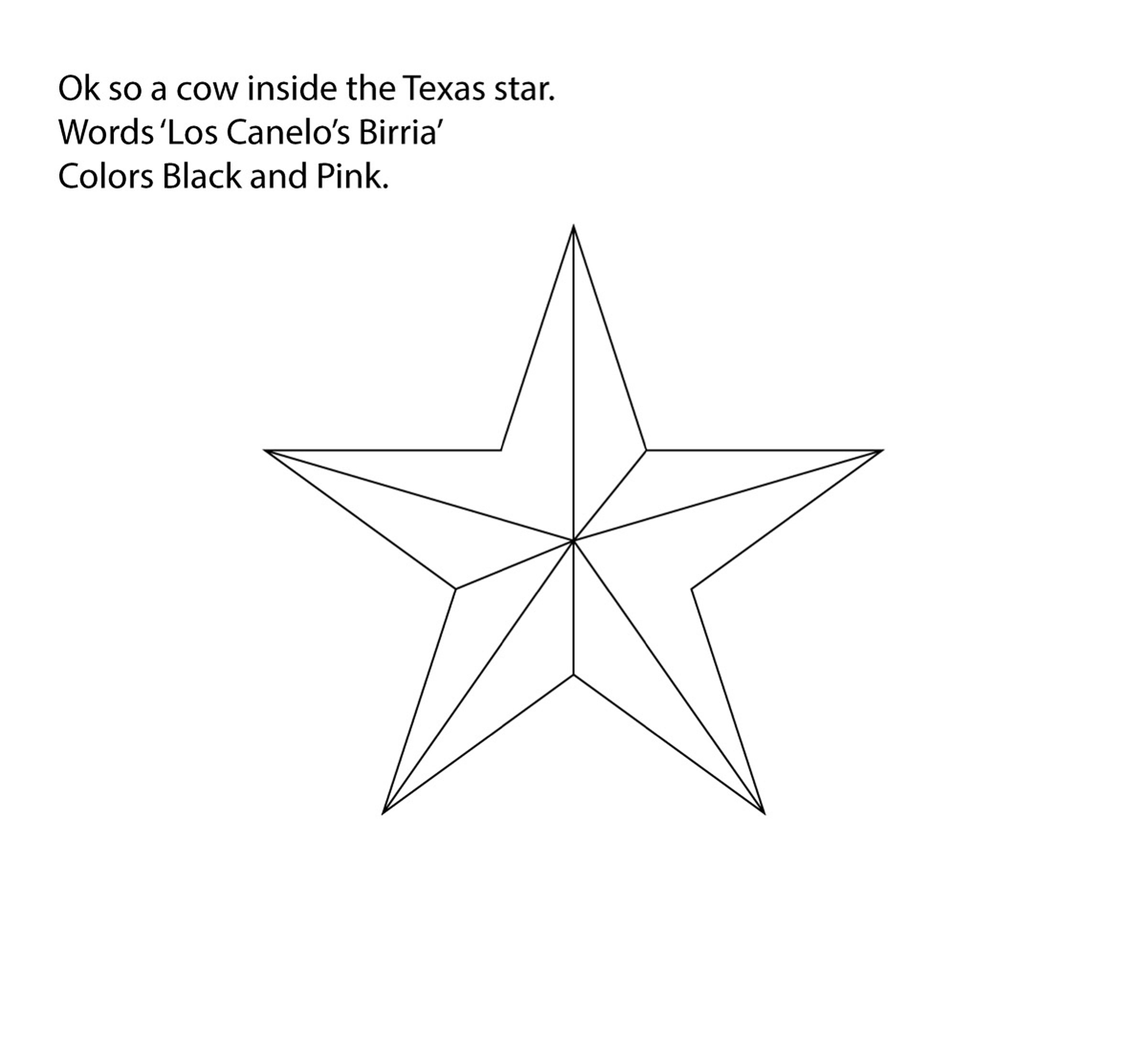
The written brief above a plain line drawing of a Texas barn star: a cow inside the star, the words Los Canelo's Birria, and black and pink as the colors.
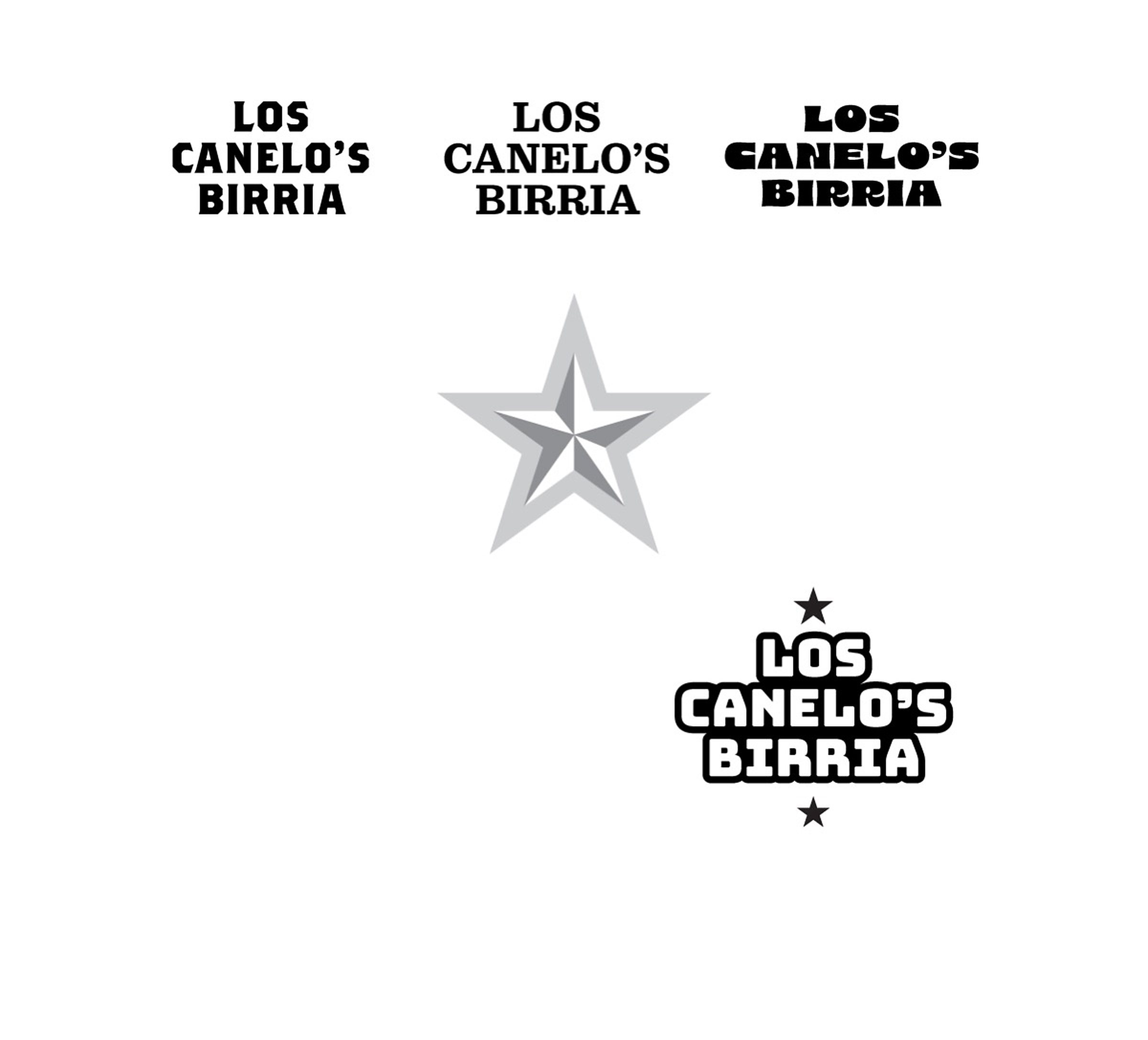
Type exploration for the wordmark: four settings of Los Canelo's Birria in slab and rounded faces, a layered grey star between them, and an outlined lockup with a star above and below.
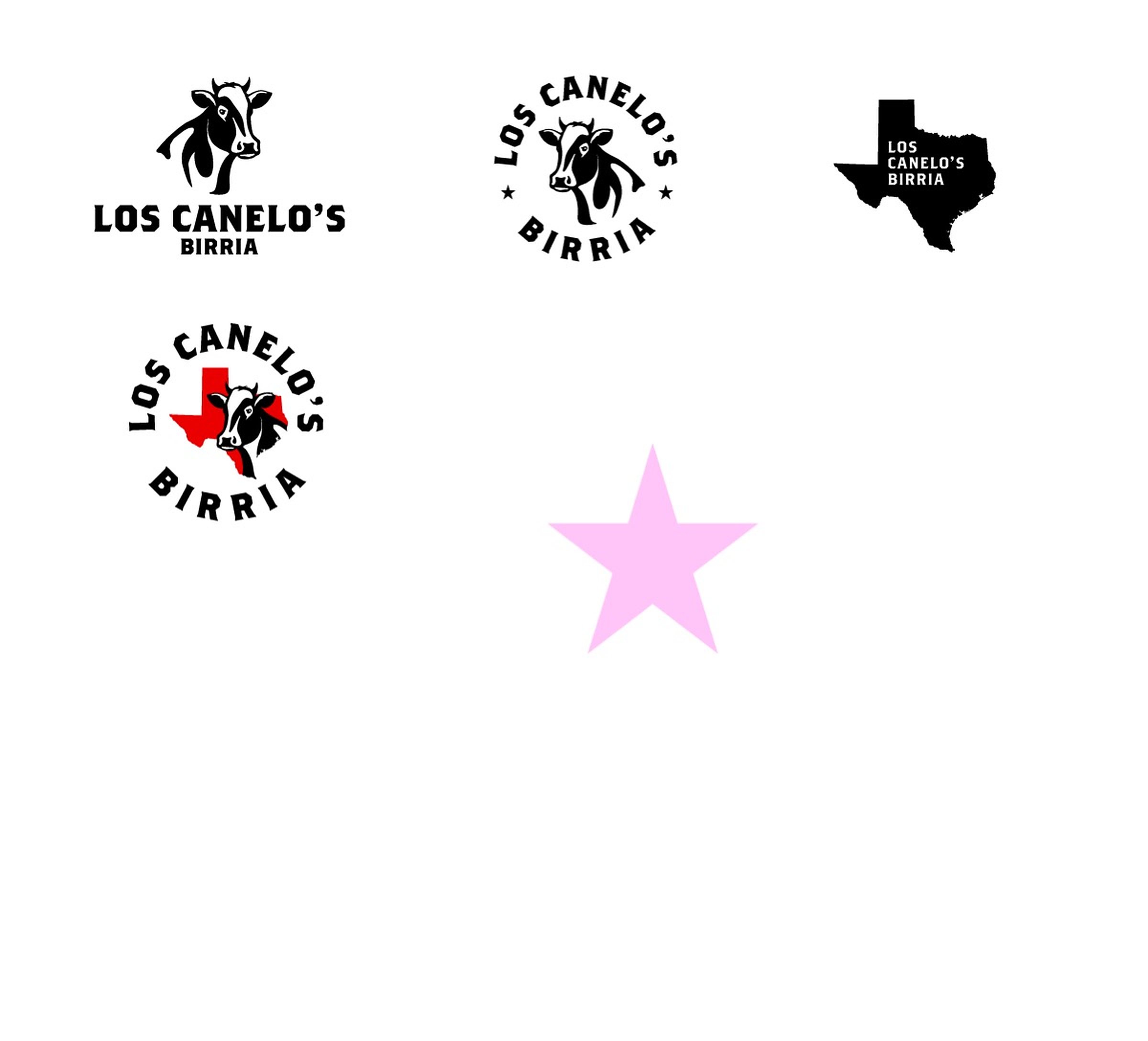
Four lockups tried side by side: a cow head over the wordmark, a circular badge with the cow ringed by type and stars, the name knocked out of a solid Texas, and the badge set over a red Texas.
The stacked lockup on textured paper: a black and white cow head above Los Canelo's Birria, with est. 1995 and Texas USA set small beneath.
A round badge on textured paper: a cartoon cow face ringed by the name and two stars, set in black on a yellow disc.
An arched version of the mark on textured paper, Los Canelo's curving over a cartoon cow face with Birria between two stars beneath.
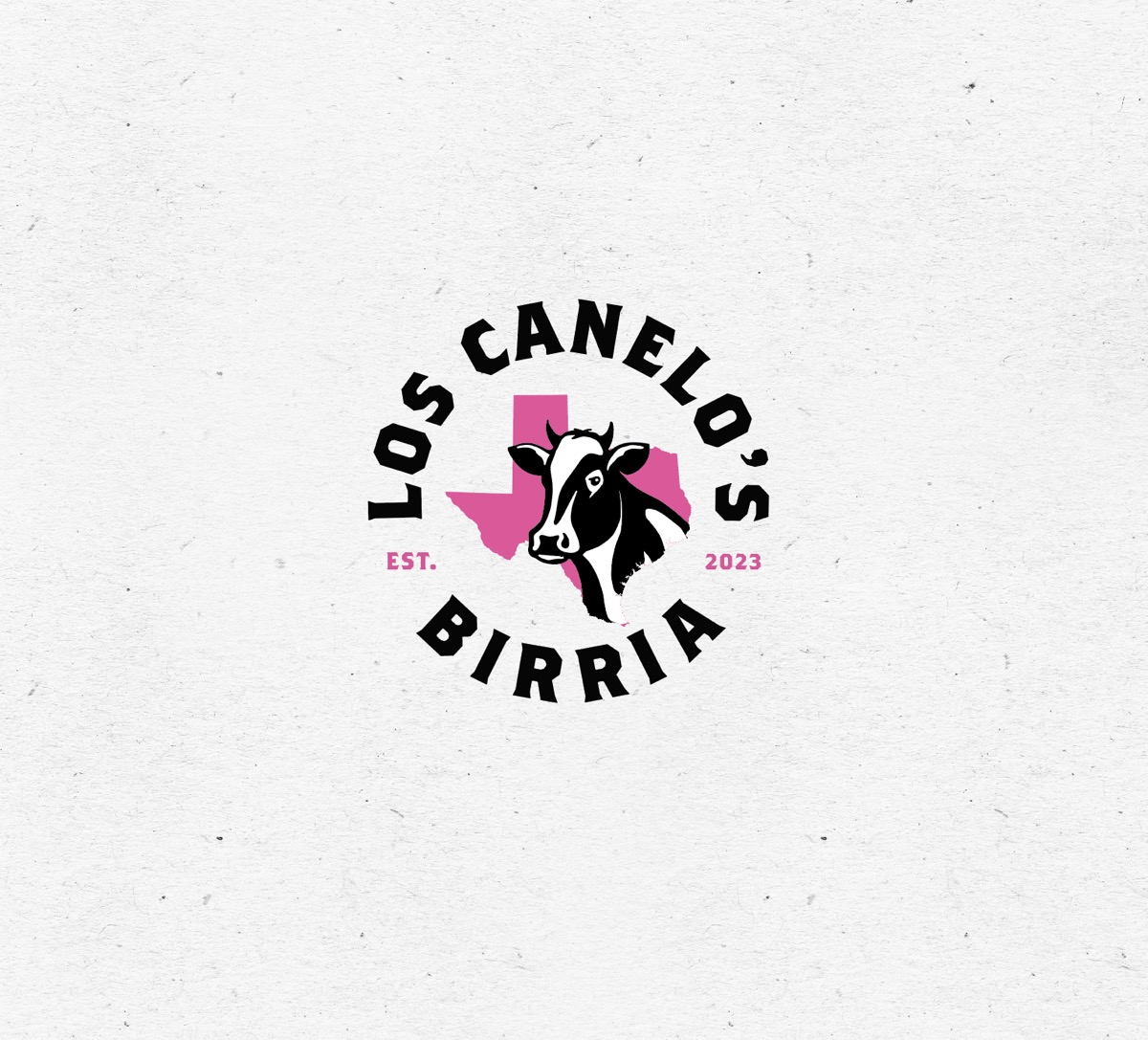
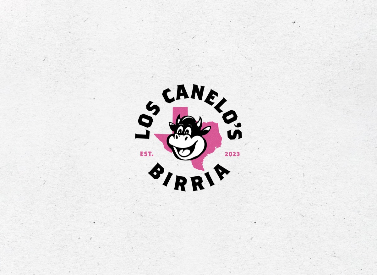
The circular mark on textured paper: black type ringing a pink Texas silhouette with a black and white cow head over it, est. and 2023 set either side.
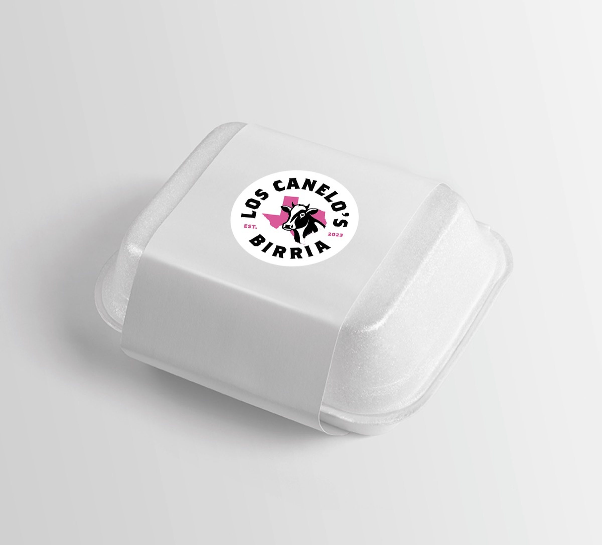
The mark applied as a round label on a white foam takeout container.
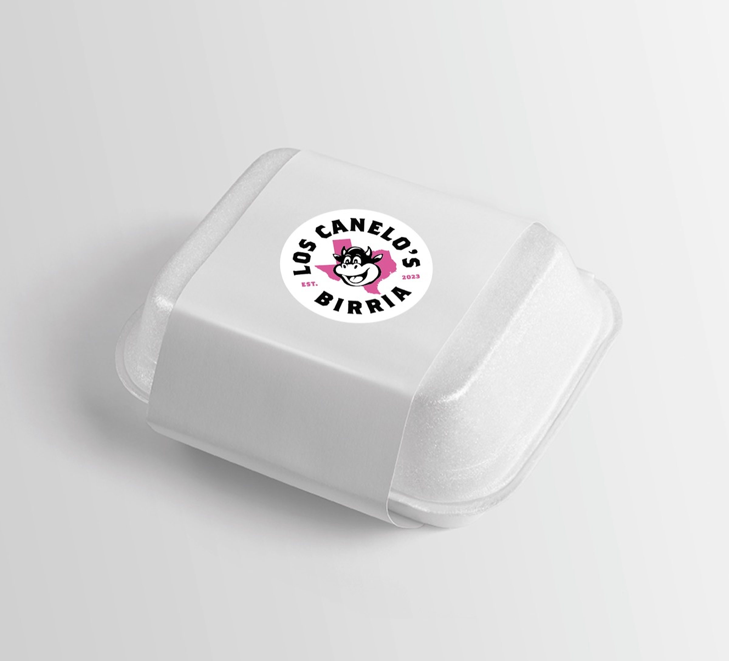
The same takeout container carrying the cartoon cow version of the round label.
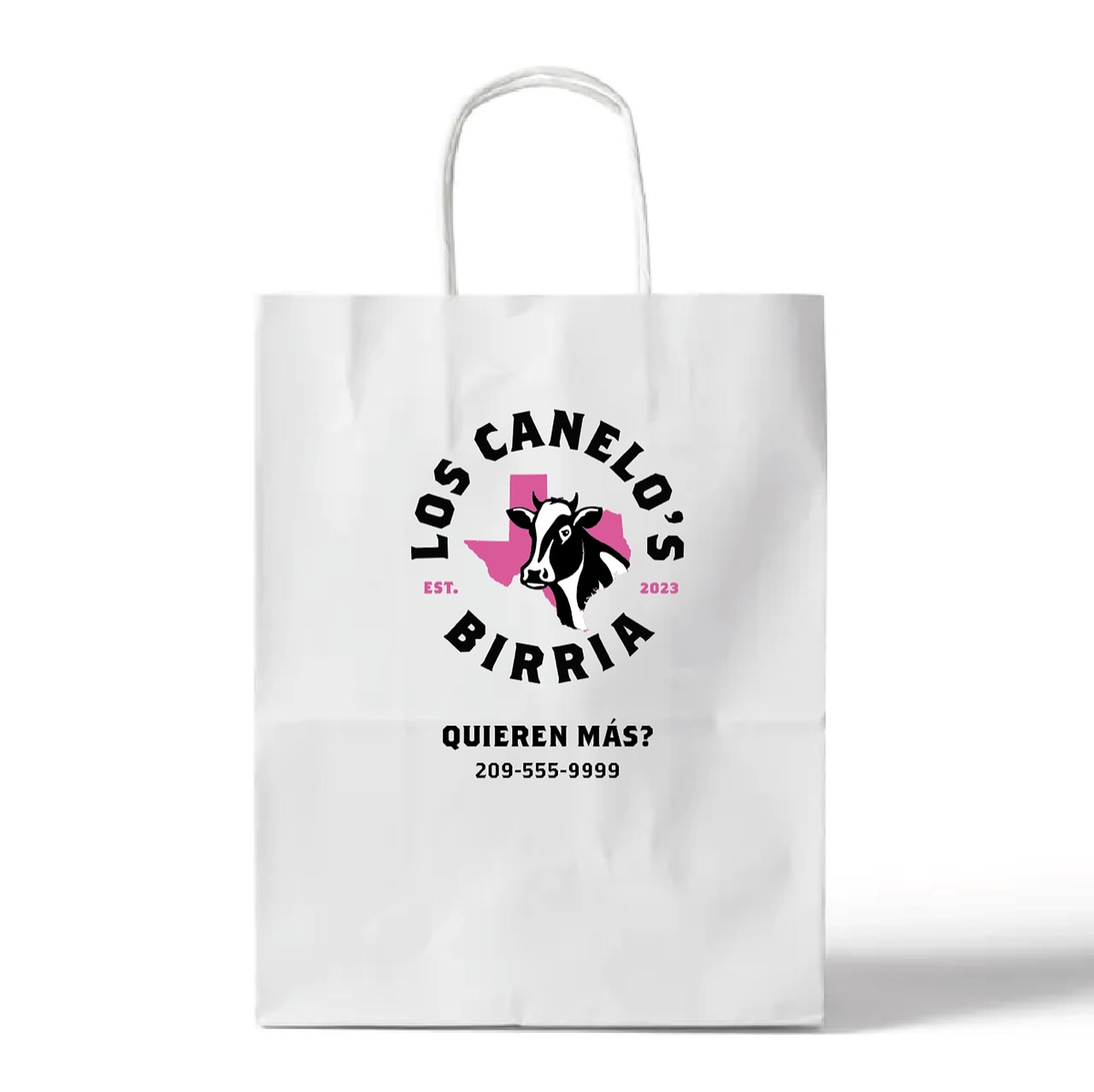
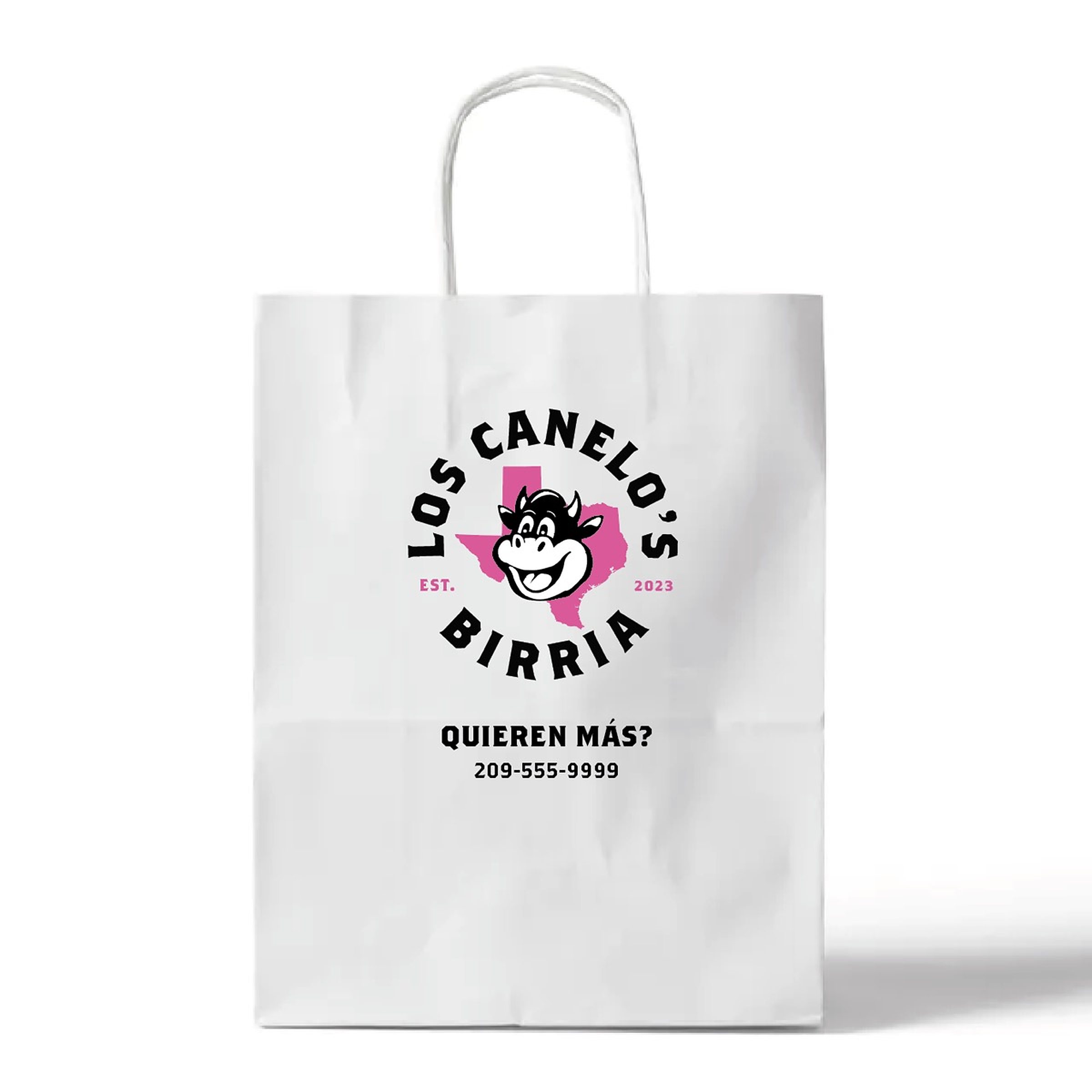
A white paper takeout bag printed with the circular mark, Quieren Más? and a phone number set beneath it.
The same bag carrying the cartoon cow version of the mark, printed larger.
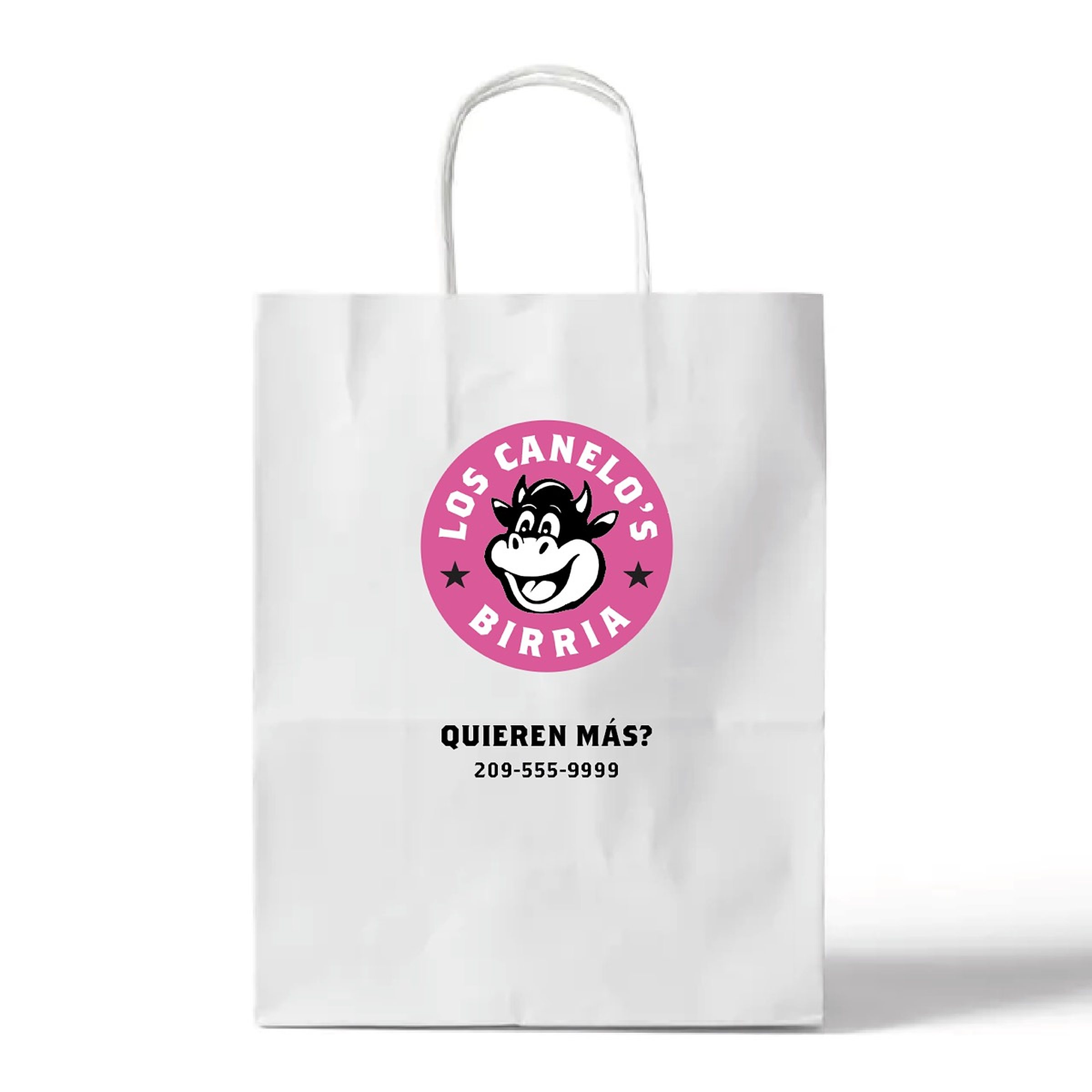
The bag again with the mark reversed out of a solid pink disc, the type in white around the cartoon cow.
The finished mark centered on textured paper: black type ringing a pink Texas with the cartoon cow face on top.