Chris Almaguer Data visualization design

Newsroom

Editorial page design

Covers, feature spreads and pages in print for the Silicon Valley, Sacramento and San Francisco business journals. The same grid that carried the weekly data page, carrying the rest of the paper.

ACBJ Print

01 - Context

A cover is read at three distances

On a rack, a reader gets a second and sees one shape and one headline. In the hand, they read the deck and the chart. On a phone it is a thumbnail, and everything but the largest element disappears.

Which distance mattered was never mine to choose, so the page had to hold all three: one dominant element, a headline that survives being shrunk, and a palette tight enough to read beside eleven others in a feed.
Covers and feature spreads

13 pages, 2020 - 2021
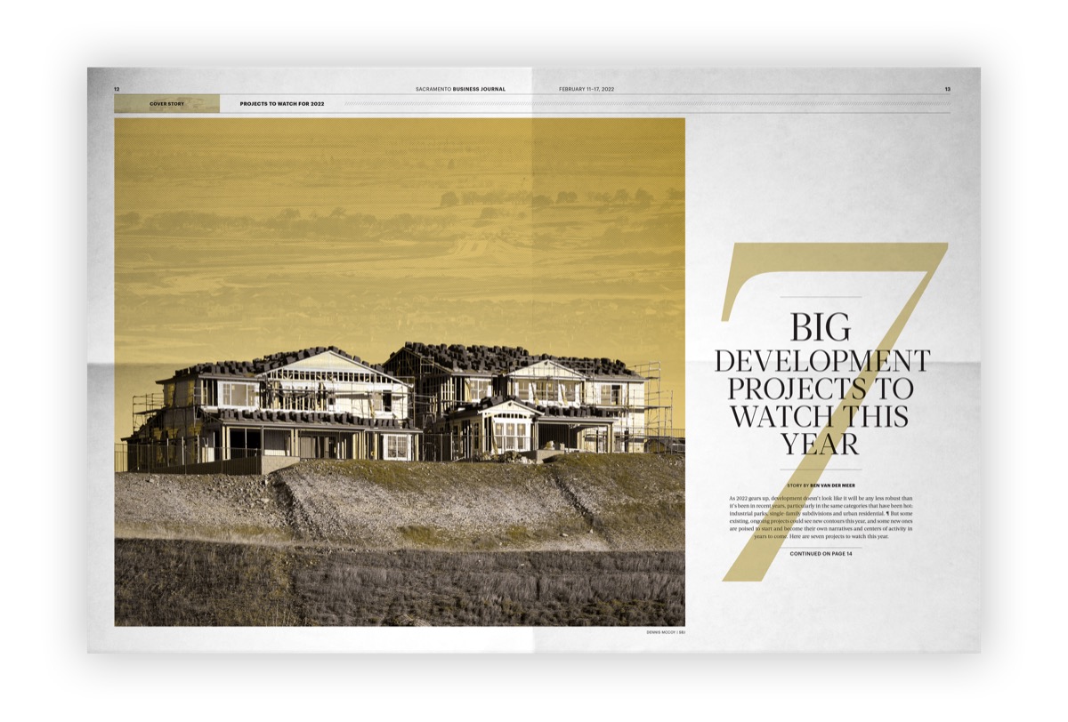
Sacramento Business Journal cover spread, 7 Big Development Projects To Watch This Year: a gold duotone photograph of houses under construction with a giant numeral seven set behind the headline.
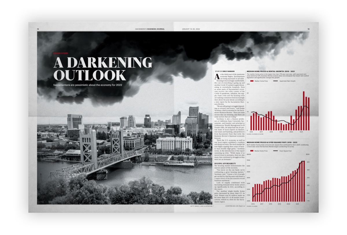
Cover spread, A Darkening Outlook: a black and white river and skyline under storm cloud, with a red line chart falling away down the right column.
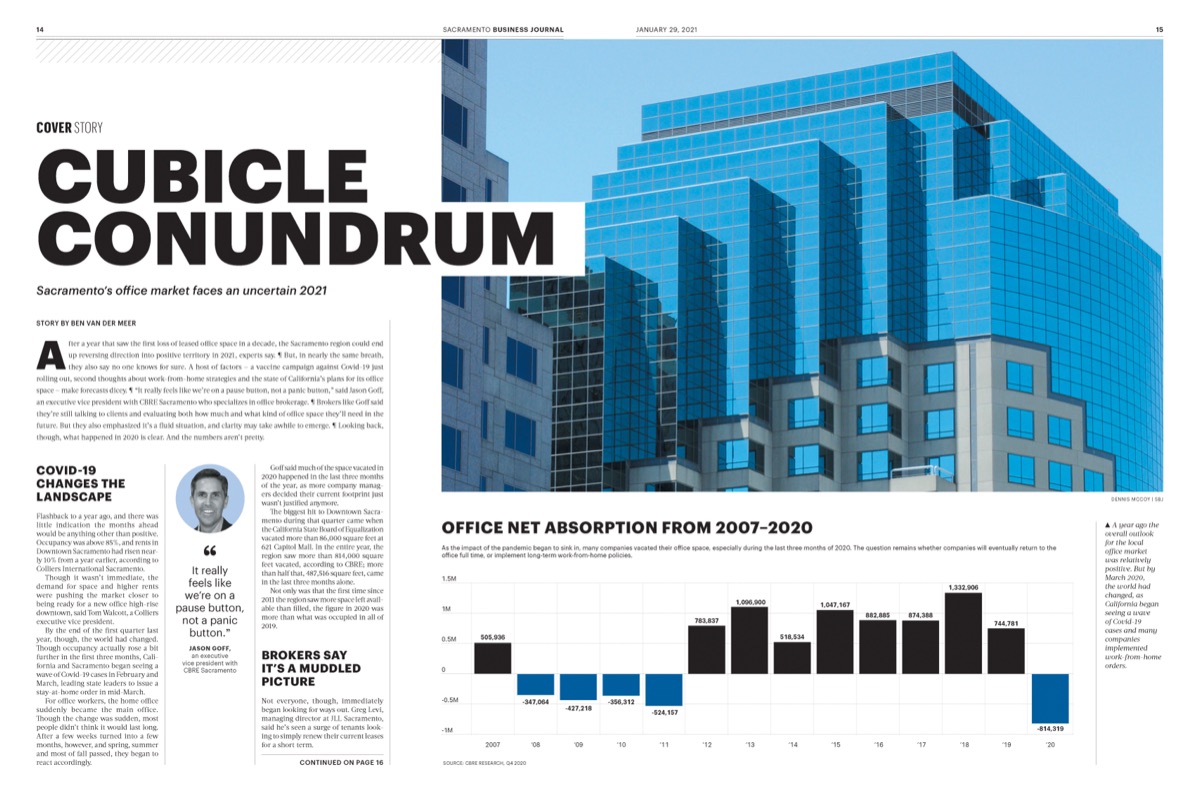
Cover spread, Cubicle Conundrum: a blue glass office tower against a bar chart of office net absorption from 2007 to 2020, negative years dropping below the baseline.
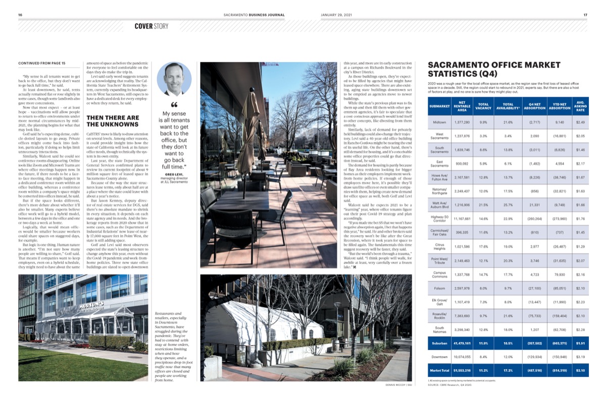
Sacramento office market spread: building photographs across the top, with a full quarterly statistics table of vacancy, availability and absorption by submarket beneath.
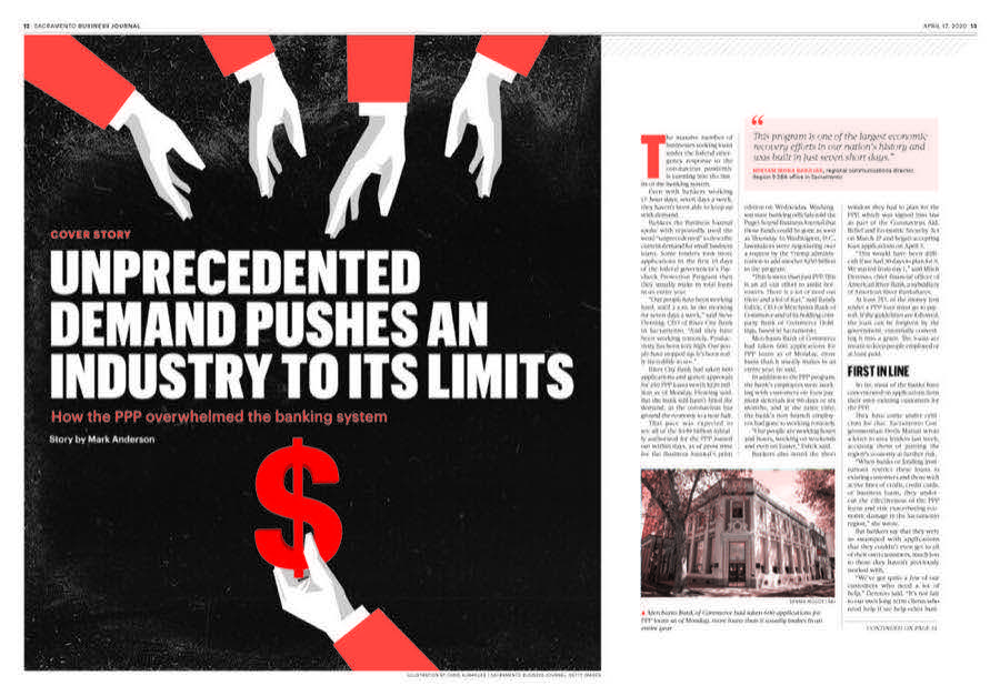
Cover spread, Unprecedented Demand Pushes An Industry To Its Limits: orange hands reaching down a black page toward a red dollar sign.
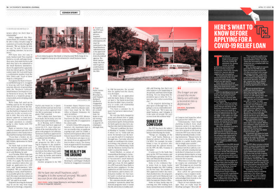
Feature spread on COVID relief loans, sepia photographs of storefronts across the top and a dark sidebar of what to know before applying.
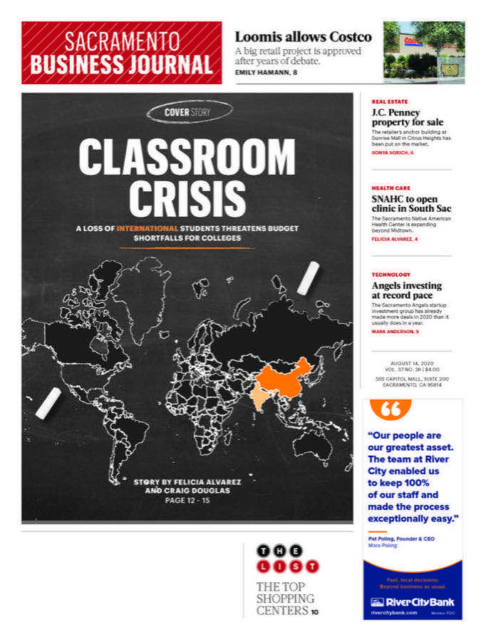
Cover, Classroom Crisis: a dark page with a world map, the affected regions picked out in orange.
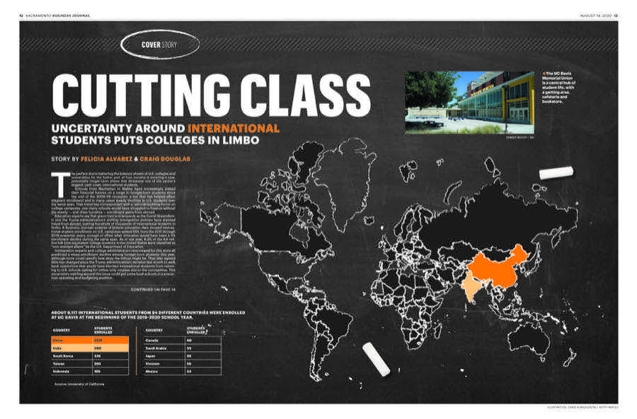
Cover spread, Cutting Class: a world map in orange and grey on a near-black ground, on uncertainty around international students.
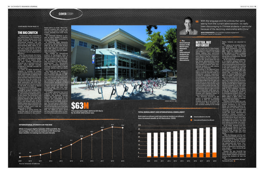
Feature spread on a campus funding gap: a photograph of the quad, a 63 million dollar figure set large, and an orange bar chart of enrollment by year.
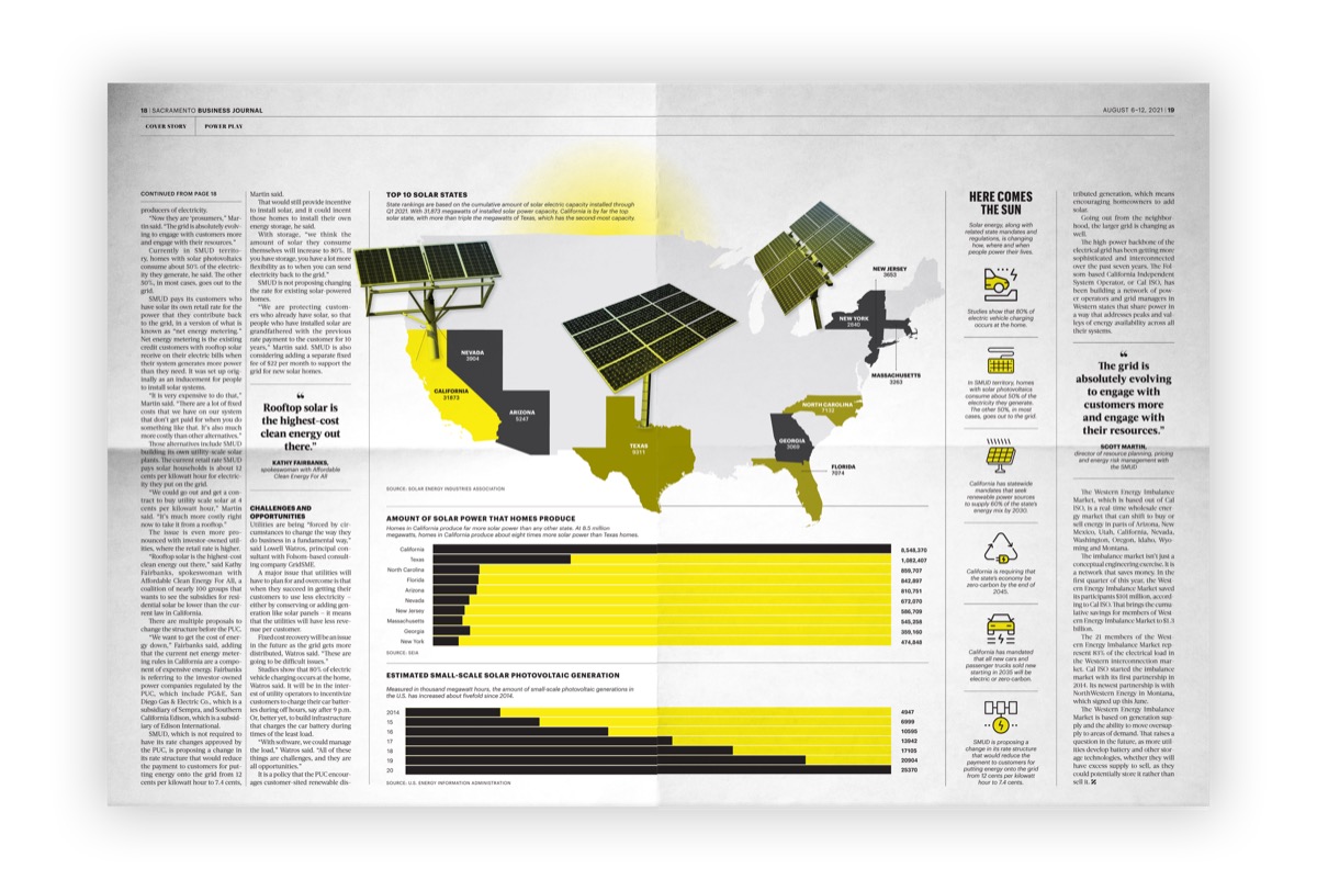
Solar power spread, Here Comes The Sun: photographed solar panels standing on a United States map, with the top ten solar states called out and yellow bar charts of generation below.
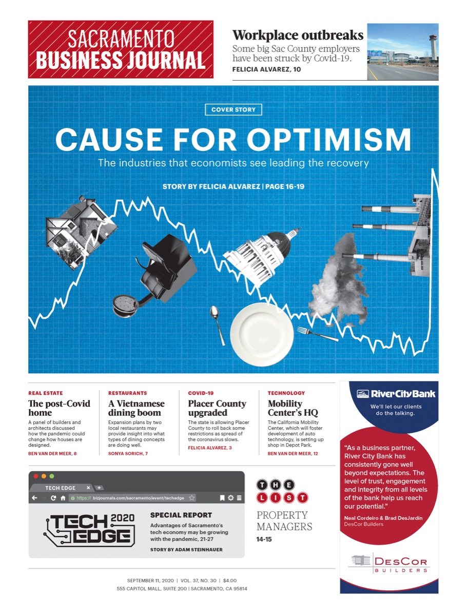
Cover, Cause For Optimism: a blue page with illustrated figures around a rising line chart, on the industries economists expect to lead the recovery.
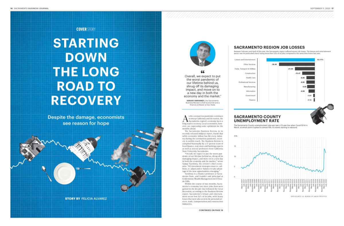
Cover, Starting Down The Long Road To Recovery: illustrated figures walking a road into the distance on blue, with employment charts alongside.
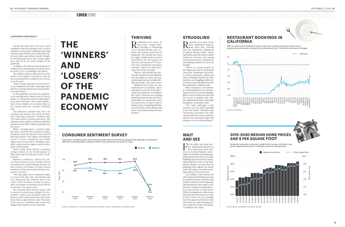
Feature spread, The Winners and Losers of the Pandemic Economy: three columns of line and bar charts comparing sectors across the year.

02 - News pages

The pages in between

Between the weekly data page and the cover story sat most of the paper: local news, one story at a time, usually one chart or one illustration and whatever space the section had left that week. Less room than a cover and the same deadline.
In print

12 mockups
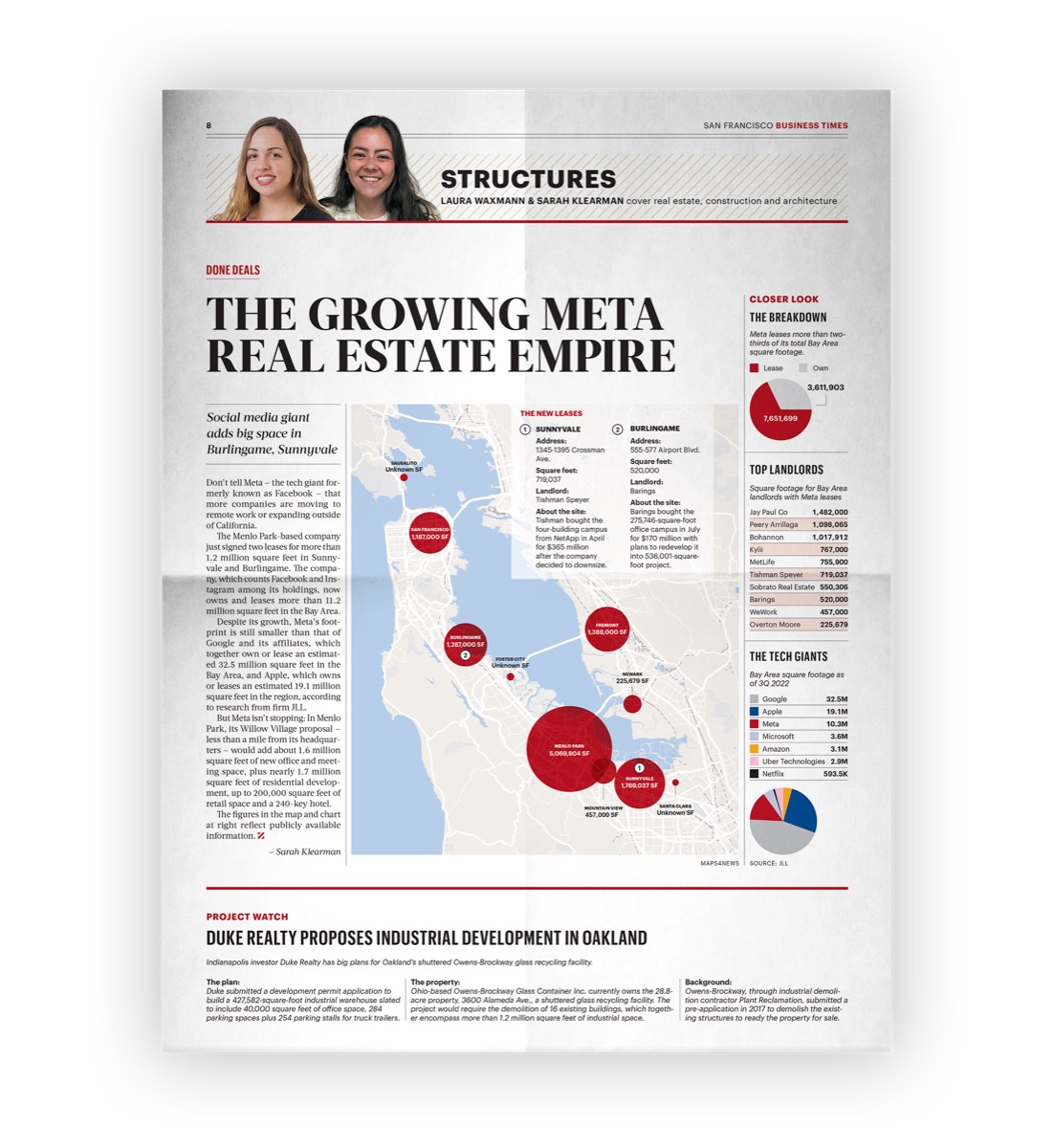
Printed page, The Growing Meta Real Estate Empire: a map of the Bay Area with red circles sized by each holding.
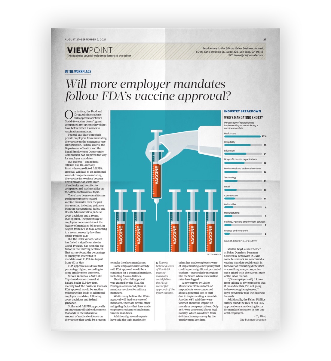
Printed Viewpoint page asking whether more employer mandates follow FDA vaccine approval, an illustrated syringe beside a ranked industry breakdown.
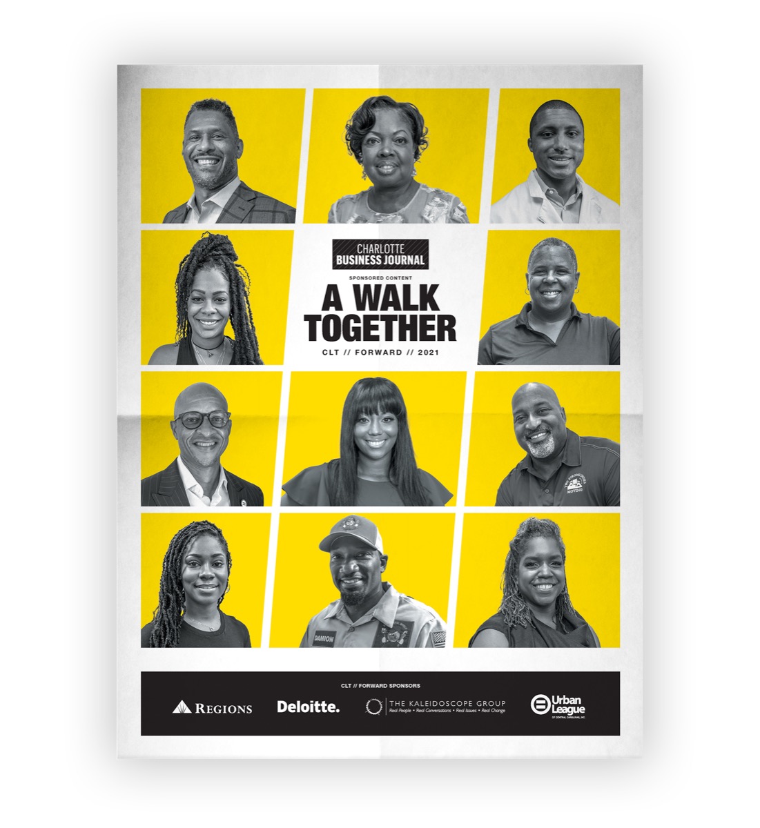
Printed poster, A Walk Together: a grid of portraits on a yellow ground.
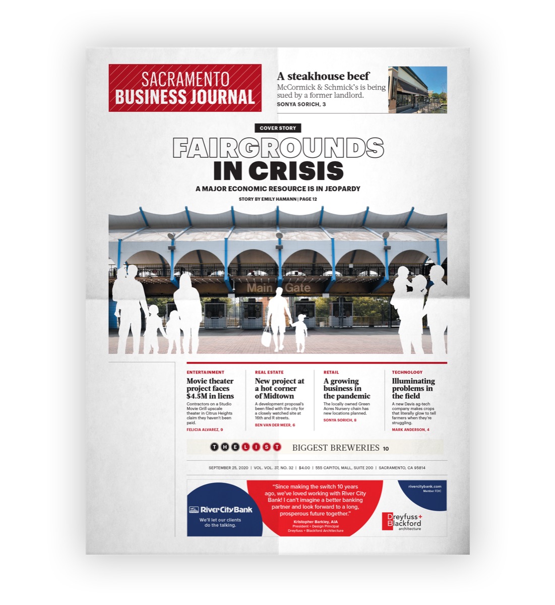
Printed cover, Factories In Crisis, from the Resilient Sacramento series: an illustrated arcade of factory buildings above a row of contributing factors.
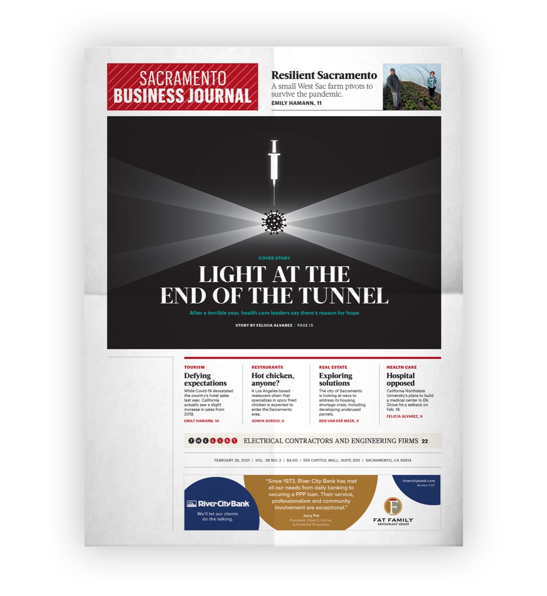
Printed cover, Light At The End Of The Tunnel: a dark page with light breaking through a tunnel mouth.
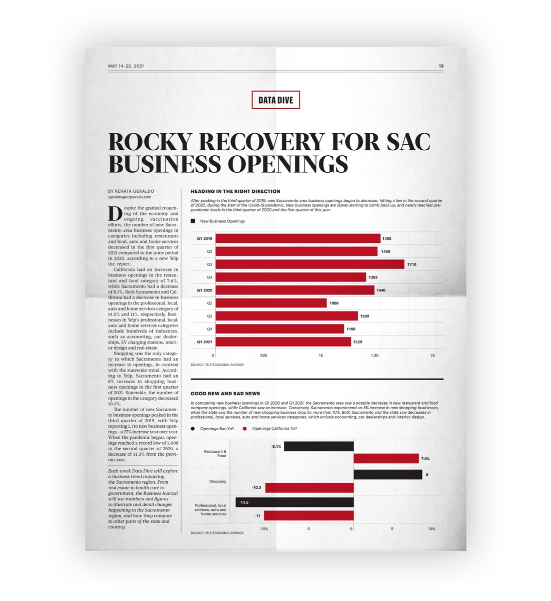
Printed page, Rocky Recovery For Sac Business Openings: a red horizontal bar chart running down the page.
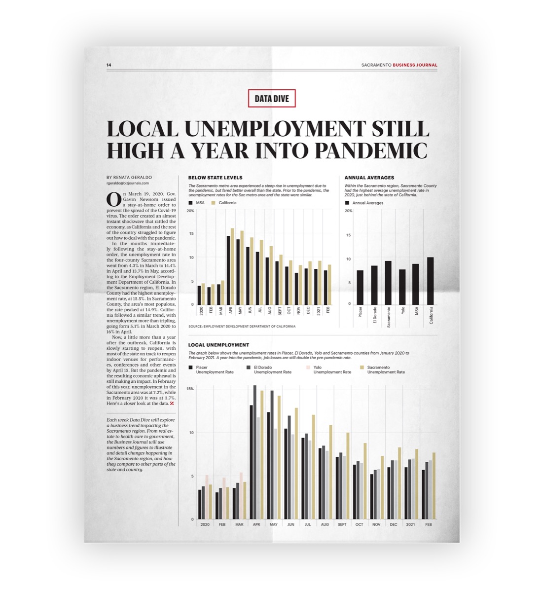
Printed page, Local Unemployment Still High A Year Into Pandemic: grouped bars comparing rates across months.
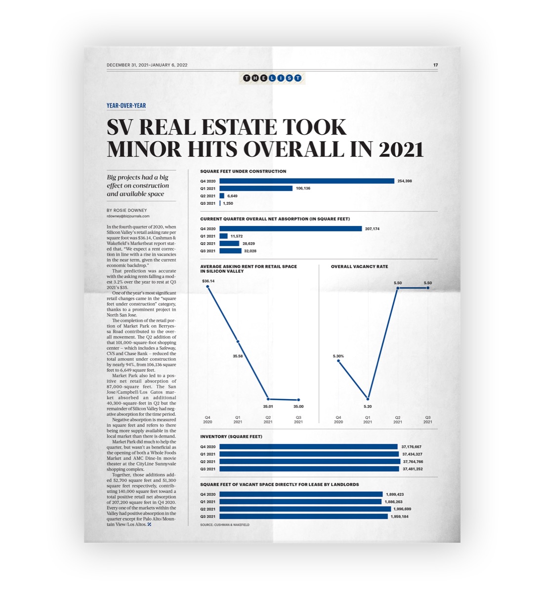
Printed page, SV Real Estate Took Minor Hits Overall In 2021: a blue line chart with a sharp dip and recovery.
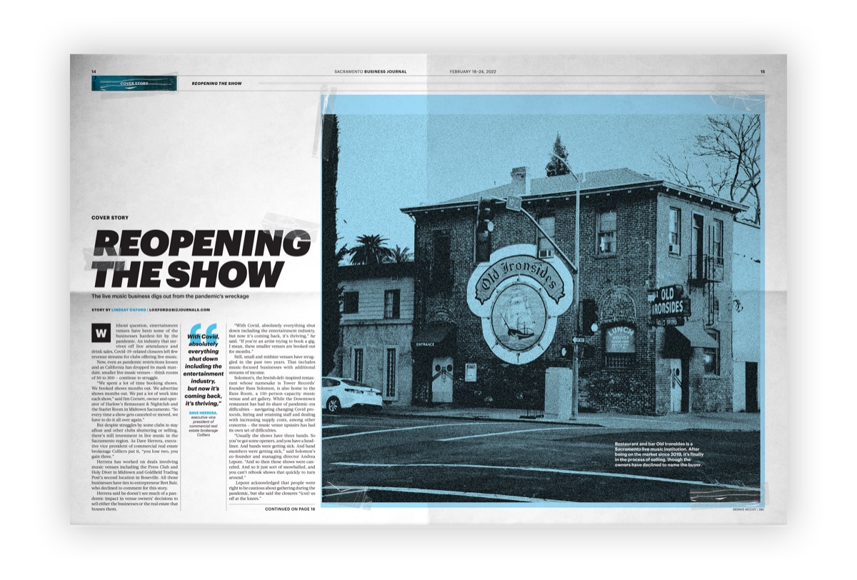
Printed spread, Reopening The Show: a duotone photograph of a shuttered theatre across both pages.
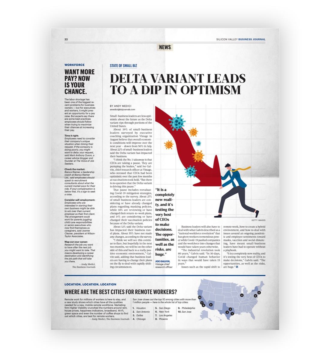
Printed page, Delta Variant Leads To A Dip In Optimism: a red arrow curving downward past virus particles.
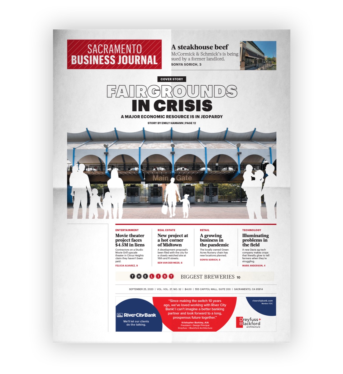
Printed cover from the Resilient Sacramento series, Factories In Crisis, shown as a folded newspaper.
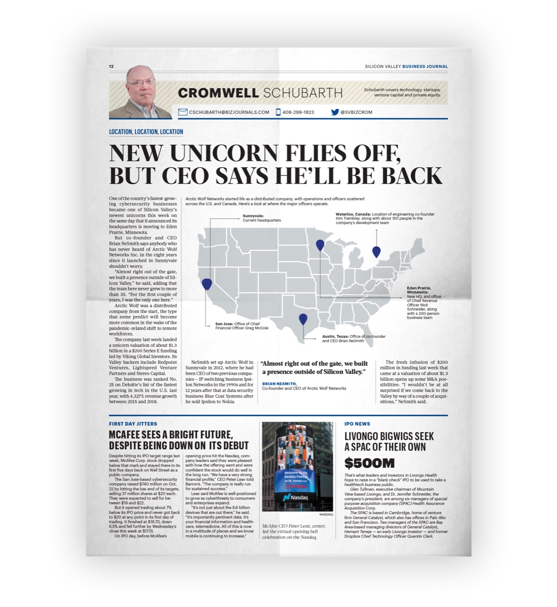
Printed page, New Unicorn Flies Off But CEO Says He'll Be Back: a United States map with red location dots.

03 - Impact

The charts had to survive the cover

The part I would defend is that the data did not get demoted to make room for the art. A darkening market is a photograph and a falling red line on the same page. A funding gap is a campus photograph, one large number, and a bar chart of enrollment. The chart is not an illustration parked next to the story, it is the reason the headline is allowed to make its claim.

Keeping both legible is a constraint problem more than a taste problem. Two colors and one dominant image leave enough contrast for a chart to hold its own at thumbnail size; four colors and a busy photograph do not, and the chart is always what gets sacrificed.

Four years of this, on a weekly cycle, across three mastheads. The same rules carried a routine market wrap and a breaking cover story without being renegotiated each time, which is the only real test of whether a set of rules is a system or a preference.


Identity and branding

A full branding study for Los Canelo's Birria, with a mark for Bone Pit Smoke House under it.

Next